I Don't Let AI Think For Me
What building this site with AI actually looks like
The first version of the new logo looked like a worm.
A fully animated, symmetrical logo concept with mirrored bars pulsing outward from the center like a radiating signal. The gradient ran from violet into mint with the wordmark locked in underneath. Technically, it did everything I asked for. But I looked at it for about a second and thought, that's a worm.
I don't necessarily have good taste in design. I have my taste, and a worm wasn't going to work for me, no matter how closely it rendered what my original request was.
I've spent the last couple weeks building the new harmonybizservices.com with AI. The homepage, the BizScore product, and now this blog. I'm an AI optimist. I think these tools are genuinely powerful, and I use them daily, for real work, without apology.
But I've also watched people I know (managers, business owners, teammates) get that dopamine hit from generating volume. Twenty-page outlines for ideas that maybe have a half page of thought behind them. Checklists, protocols, proposals. Dump-truck loads of it, technically complete but functionally uninspired. Nothing in it traceable back to a real decision. I've watched people stop writing complete sentences to each other. An email that should carry a real thought gets reduced to a text-message fragment, something like update?, while the actual thinking happens inside a ten-tab spreadsheet nobody but the AI that generated it could ever explain, waiting to be dumped into another prompt for a bullet-point summary of itself.
That's outsourcing your judgment and calling it productivity.
So below is some of what actually happened when I built this site. Not the polished version, the real one, including when it broke and times I had to ask for an adjustment.
I abandoned this project once already
The old homepage was full of personal photos. There was a big picture of my face right up top. It looked like a personal page instead of a business.
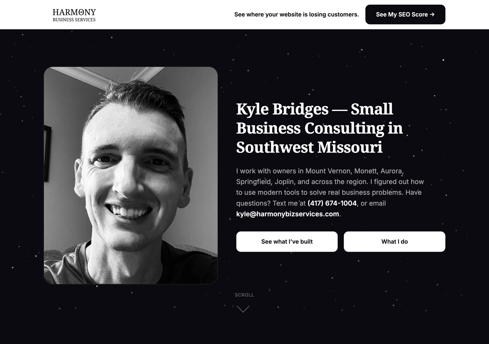
At some point a few months back, I actually gave up on rebuilding it. I walked away from the whole idea. When I came back to it, I came back with a different point of view, not just a task to finish. I wanted something that looked like a sleek, modern SaaS product, not a headshot with a random tagline. In the years I've spent in sales and marketing, I have certain opinions about what makes a company feel honest, like clean design, copy that sounds like a person wrote it, a site that doesn't oversell what the product does. I prefer that show up everywhere, from the ad copy, to the blog, and the homepage. Otherwise it doesn't feel genuine.
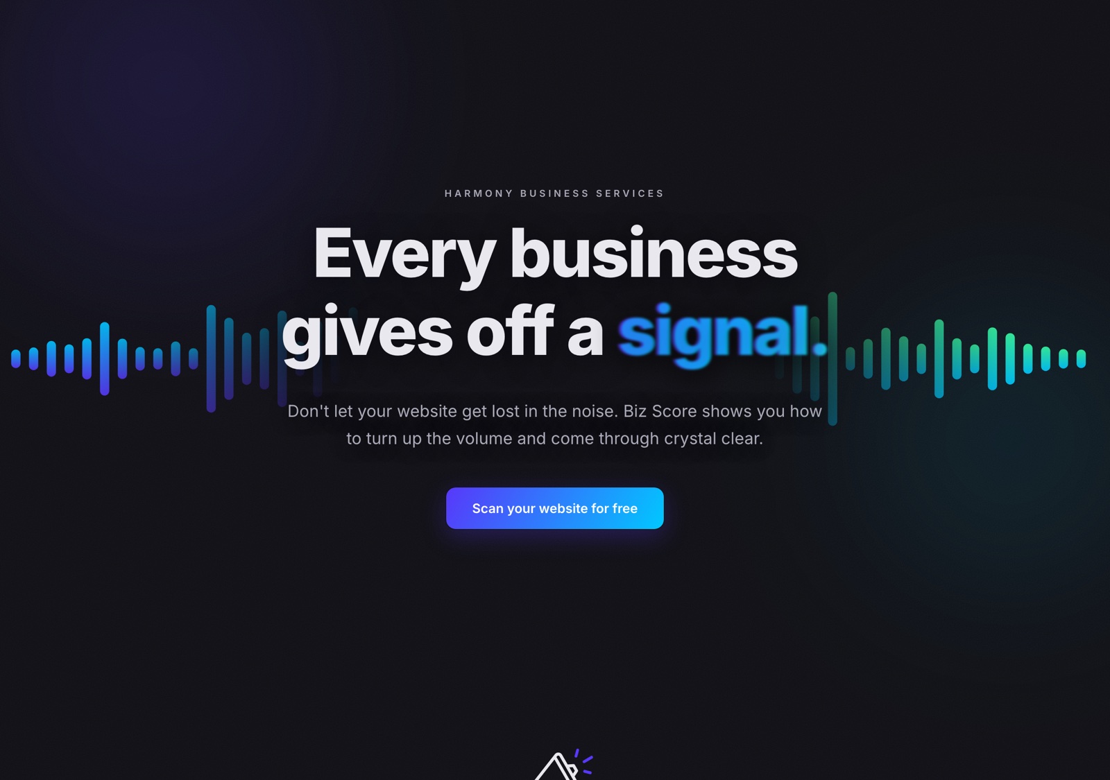
I didn't type a prompt and get a finished homepage in an afternoon. I ruminated for weeks before starting anything, and once I started, the pattern of working sessions outlines the cadence of how this was built.
- 4:34pm to 1:08am.
- An afternoon hour and a half, then an hour late at night.
- Quick 20 minute session to poke around.
- A session starting at 2am, then a four-hour block starting at 9am.
- 5:28 to 7:00 in the morning, before the day job started.
- Another early one, 6:55 to 8:12am.
- And the thread that I'm working on this post in, starting at 9:58pm and still running.
I don't lay the details out to be impressive, it's just the pattern I have to use to get things done. Early mornings, a night that ran past midnight, a tiny session that barely counts, spread across multiple weeks, fit around a day job and trying not to steal time from my wife and kids.
The very first pass at this build went through a different tool entirely. An autonomous agent called OpenClaw that lives outside a browser and works through messaging apps instead of a chat window. I'm tool-agnostic so I gave it about ten hours across a few sessions and it got me started. But the way it organized itself didn't fit how I actually work, so I moved on.
The site telling on itself
The actual business of Biz Score went through its own version of this. The first pass had a headline that didn't make sense to me, and a form field that was nearly invisible depending on your system's color theme. Now I built the system to respect your device's light or dark mode instead of assuming one. I didn't really plan that in advance but it's certainly something that needed consideration.
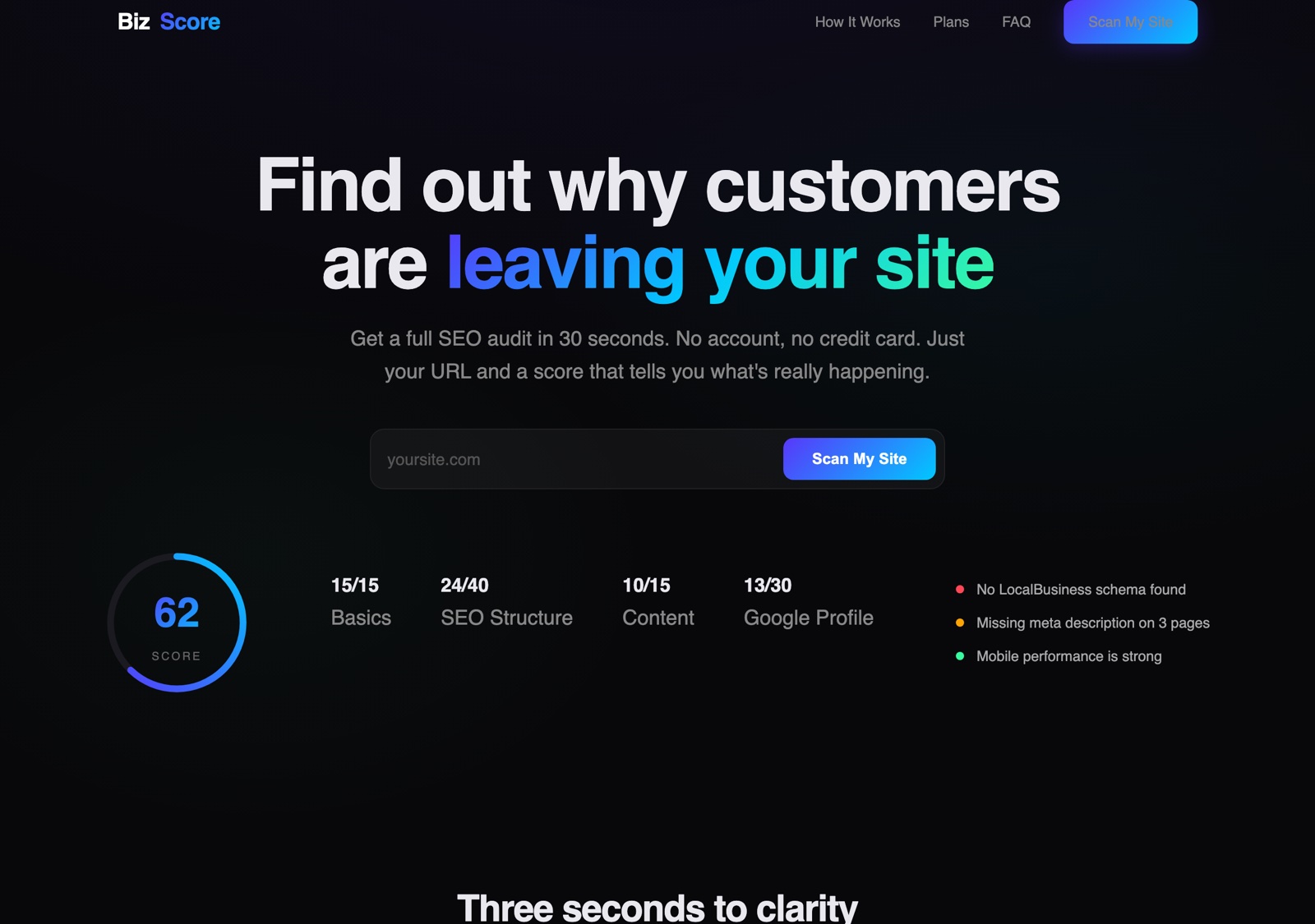
I spent a long time playing with how the score animates once you submit a URL. And in the first version, the page barely reacted when you did. It just sort of updated in place, with nothing telling you anything had happened. I didn't catch that one myself. My friend Christian, who works at a local marketing agency, was clicking around the live version and gave me a heads up after I asked him to pick the site apart. That was something an actual human had to catch and probably wouldn't have shown up on an AI generated QC checklist.
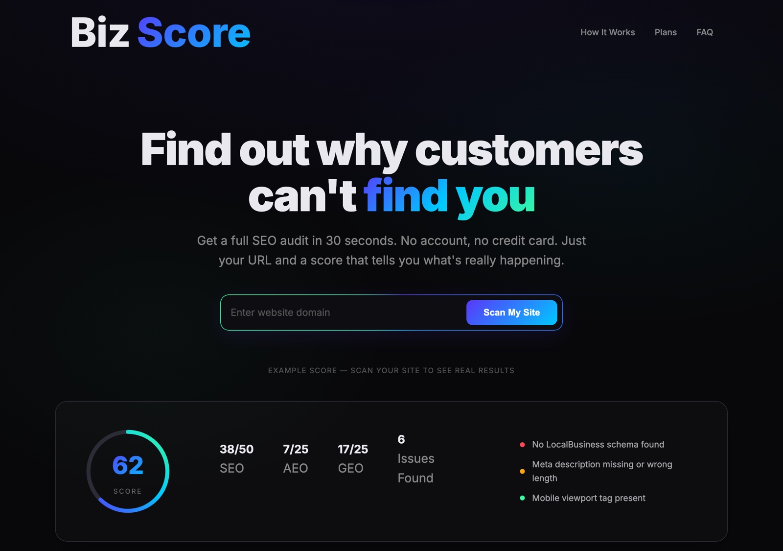
It's fun to put little easter eggs in here and there. One is in the border of the url field on the Biz Score site. I wanted to highlight the box because it originally blended in with zero border or highlight. And if you know how to prompt it right you can achieve these pure CSS elements to make things pop.
Back to the worm
"The worm" was one of six original concepts, all attempts at the same brief to take the original waveform mark and make it symmetrical. "Center Peak" was the one that actually worked for me with the same mirroring, but with a single dominant peak in the middle that holds its shape through the whole animation instead of squirming.
The wordmark went through the same process. Mirrored a different way reflecting the original mark's texture instead of generating a symmetric pattern from scratch.
The one above, M1, is close to what I landed on. The one that actually shipped, M2, is a different element of the same technique, and it's pretty hard to tell the two apart. I sat there choosing between two nearly identical logos because those details matter to me. That's mostly what projects like this are. A string of little decisions instead of big dramatic ones.
Even today, building this post wasn't frictionless
The blog you're reading this on didn't exist a few days ago either. Getting it live meant a real decision about its architecture. Hand-edited HTML, or a proper build system with a CMS I could actually write in without touching code. I picked a CMS but not before Netlify silently blocked the first deployment over an "unrecognized Git contributor," a security check that had nothing to do with the code but with account permissions that I didn't catch on the first pass.
At about the mid-point I told Claude to go ahead and enter my GitHub credentials into a settings form for me. It told me flat no, even after I told it to proceed. Typing an API secret into a field is a line it won't cross so I had to do that myself.
And that's kind of the point. Not that AI can't do certain things, it can clearly do a lot, but that there are some things that it shouldn't do. Some things, whether they're design decisions or handling sensitive data should be handled by people.
Where this leaves me
Every real decision in this project was still mine. The worm, the restart, the theme fix born from a bug, considering different versions of a logo, walking away from a tool that didn't work right. AI didn't make any of those calls. It gave me faster ways to test more of them. Something more like a very capable collaborator with infinite patience than a replacement for judgment.
That's actually the same lens BizScore applies to your business site. Digesting and outlining the ways your businesses digital presence can be improved. And how carefully you manage your visibility online is important. Whether that's deciding to make your logo look like a worm or building a site that helps an AI answer engine accurately advise us on what your business does. The tools we use may change but injecting your judgement into the equation should not be optional.
I don't let AI think for me. It helps me work faster once I decide the important stuff.